Art Critique Thread

FishForums.net Pet of the Month
🐶 POTM Poll is Open! 🦎 Click here to Vote! 🐰

SirMinion

Sexy Martha Fahaka
Retired Moderator ⚒️
Joined
Mar 14, 2004
Messages
4,038
Reaction score
1
Location
East coast of England.
If you have produced a creation and you want to know if it's any good, post it here and people can reply with constructive criticism.
To post your picture, first upload it to the internet using a site such as flikr, MSN groups or photobucket.
To get it on the forum use this code:
Code:
[img]http://www.your_image_address.jpg[/img]
Here are some guidline for both artists and critics:
  • This section is for original artwork so please do not post an image if you did not make it.
  • Please keep the image less than 600 pixels wide
  • Images created in any format except photography are exceptable for critique. Examples are:
    • Digital art
    • Paint
    • ink
    • pencil
    • collage
    • 3D and sculpture
    • Digital photo manipulation
  • If your image is a photo please post it in the photography forum, however photo manipulations are acceptable
  • Please ensure that your image is suilable for an audience of all ages
  • When discussing an image, please be constructive. Comments such as 'that sucks' will be removed
  • Please respect other people's opinions, not everyone shares your taste.
  • Please receive criticism in the spirit it was given. If you think you might get upset if someone doesn't like your work, then don't submit it.
 
Ok, I'll set the ball rolling with this:
An oldy I painted about three years ago entitled "Snail Jockey" and painted in acrylic and posterpaint on stiff board.
snalljockey.jpg
 
You hotlinked it! ;)

EDIT:

Copyed the URL into a new window...

I like it a lot! The colours are vivid and concept is very good. However, I think the perspective could be great worked on here, and, although it's actually fairly simple, I also find the background too full, and a little distracting.

:thumbs:
 
Interesting! I think the perspective is good, but I do agree that the top of the image is way too busy. Maybe if you had placed the snail more in the center of the bottom. The picture would be even, eye-pleasing, and it would pull the carrot out from the pots. The color of the carrot and the pots are just similar enough that it make the carrot the last thing your eye catches. My eyes go from the slug, to the jockey, then to his stick which leads to the carrot. However for certain pictures, that technique might not be too bad.
Overall, it's quite good. Brilliant colors, and I love the texture and highlights on the snail :wub:

As soon as my site starts behaving, I shall post a pic here. I love critique!
 
Interesting! I think the perspective is good, but I do agree that the top of the image is way too busy. Maybe if you had placed the snail more in the center of the bottom the picture would be even, eye-pleasing
I absolutely agree with you on that, but there is a reason that the compostion is top heavy. This painting was designed as a book cover illustration and the space at the bottom is where the title would go. Perhaps I should have mentioned that in the original post!
The color of the carrot and the pots are just similar enough that it make the carrot the last thing your eye catches.
You're right of course, and it's simply down to bad planning on my part. Live and learn!
 
I think the perspective could be great worked on here
Thanks for your comments, but I'm not sure I understand what it is that you're saying there.

I'm not entirely sure myself...but to me, the perspective just doesn't seem...right...

The more I look at it, the more it looks fine, however, so it may have just been a bad first impression.
 
I think it looks great....reminds me of J.R.R. Tolkien's The Hobbit. Could the carrot have been an orange caterpillar? I like it. SH
 
very nice painting sir minion. The only thing that I think you could have done to improve it was to darken the fishing line. I think that would have solved the problem of the carrot blending into the pot and of the top of the carrot appearing to be part of the plant beside it. I like it alot. I'm doing oil painting in a class at school and I could never paint anything that looks that good.

If you want to critique my art click on the links in my signature. There are just too many pictures for me to post them all again. =)
 
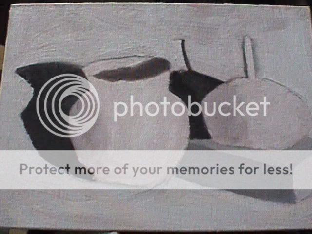
Thought I'd post something worth critiquing since sirm's painting was so good it was hard to correc it. Here's is my first oil painting. I've painted 2 since this one and I'll post them when I get pictures if people critique this one.

This painting is called...I'm out of white paint
DVC01228.jpg
 
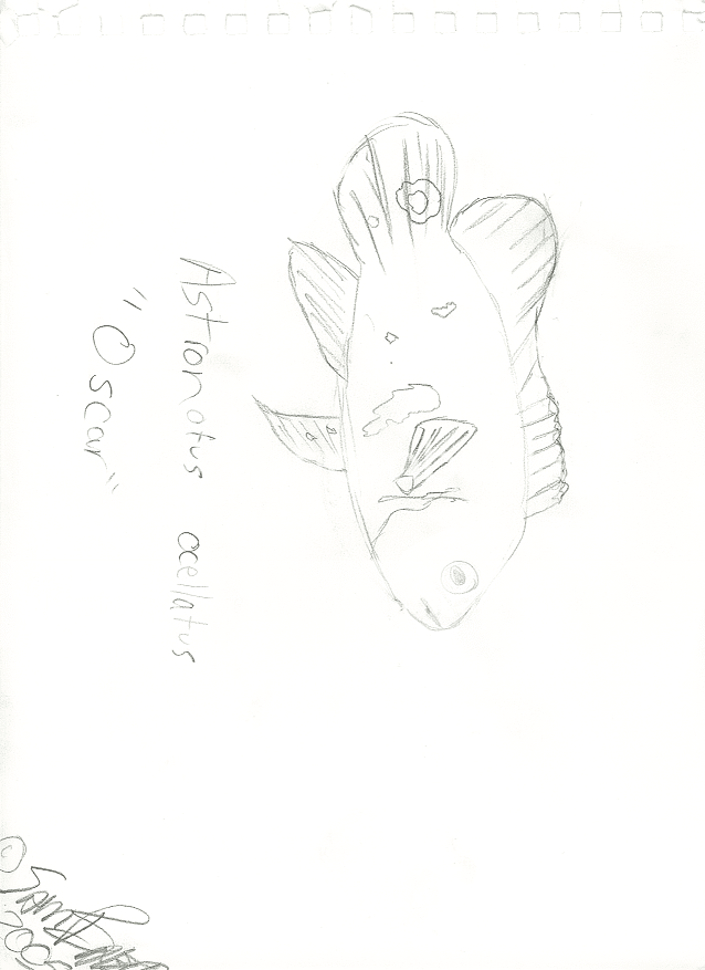
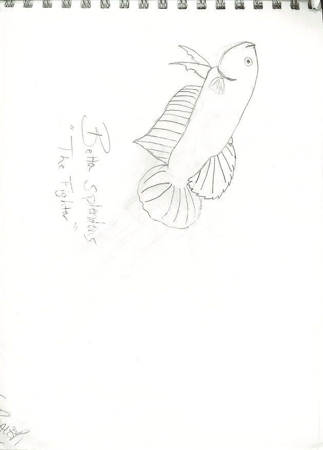
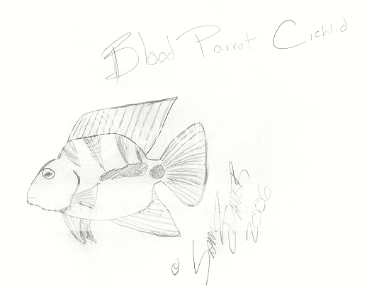
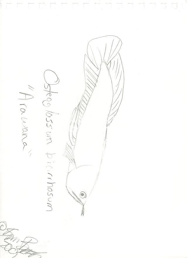
I drew a quick sketch of many fish, thought I'd post them. :)

astronotusocellatus_oscar.png

bettasplendens_thefighter.png

blood_parrot_cichild.png

osteoglossumbicirrhosum_arawana.png


Just posted the ones I think are my best. ;)
 
I'm having a problem with my painting that I think your having with your pencil work. Your afraid of messing it up. Dive into one of those pics and add detail until the thing is truely ruined then do another and don't go quite as far. The fish are pretty good as is. I can identify all of them from the pictures...which is more than I can say of my attempts at drawing fish. nice looking pics just a bit more detail.
 
Well this is good for me cause I dont' take art courses at all. I did in 6th grade, but all they did was litterally make a pot and draw 3D shapes, like cubes! :eek:
 
Okay, so I haven't been active for a loong time...*slaps wrists*...but what better way to jump back onto the TFF wagon then posting a picture and letting the rest of you rip it to shreds, eh?

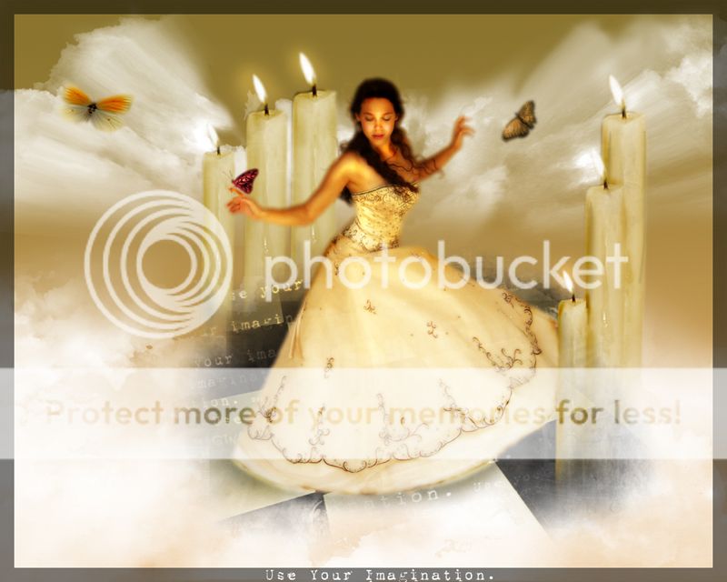
This is a photomanipulation I did just the other day, and is my first real try at it (I've done some small ones in the past, but nothing which involved much skill at all...). It has been posted on two art sites (DeviantArt and SheezyArt), but I haven't really received any critique - only one person has said anything, and I'd really like to know how I can improve!

Use Your Imagination
111.jpg


(The original is bigger, but it has been resized so that it is suitable for posting on the forums...)

Credits:
http://dove-stock.deviantart.com/ For the beautiful girl, in a grogeous dress.
http://onyxabrasionstock.deviantart.com/ For the wonderful floor. Isn't is lovely? So...checkered! X3
http://attemptestock.deviantart.com/ For the little butterfly which is resting on her finger.
For the other butterflies, I'm afriad I've lost the stock...I feel awful! Sorry...If it's yours, feel free to point out that it is, in fact yours, and I will add you to this description, because I am just hopeless... ;-;
http://myhazeyclarity-stock.deviantart.com/ For the most excellent candles!
And finally ImageAfter.com for the clouds, which I spent ages merging and such like!

EDIT:

Where would you rather be, right now? Use your imagination, s'not hard! ;)
 

Most reactions

trending

Members online

Back
Top