You are using an out of date browser. It may not display this or other websites correctly.
You should upgrade or use an alternative browser.
You should upgrade or use an alternative browser.
Tank Makeover - Amano Style- *complete*
- Thread starter paulioo
- Start date
kenneth_kpe
Lider op da pises.
^^^ what they all said !!
if it aint broke dont fix it !!! lets wait and see how the tank will fully bloom
if it aint broke dont fix it !!! lets wait and see how the tank will fully bloom
Just want to add my own little bit here and hopefully you will take what i say as constructive criticism (thats the way its intended) because im going to go against the grain here from what others have said to you.
I think a couple of things are wrong here with this aquascape
Firstly i agree with your doubts about the rockwork being too centred, basically i feel it is too centred, there is not a good spatial quality to the aquascape, also the biggest problem i have is that there is too much space left in the aquarium, the aquascape doesnt fit the aquarium IMO, there is to much black empty space left on top, the rockwork is also a bit upright IMO, the main rock on the right hand side has a straight edge on one side and my eye gets drawn to this in a negative way, its like a cutoff point on that side of the scape, also the moss is getting overgrown and you are losing the rocks, ok this just needs a prune but perhaps if the rocks filled the space better in the first place this would not be a problem, maybe the rocks or the substrate needed to be raised a bit higher, also something obvious is that you seem to have very good growth on one side and not good growth on the other with the glosso, this may be just the lighting but by the time the other side fills in you may be at the point where the other side needs redoing, anyway thats a minor point.
I think its maybe the proportions here that throw me a bit and it seems unbalanced, if you use your hand and block the top part of the scape just above the rocks, the scape looks instantly more balanced IMO and basically fills the frame a lot better.
Anyway dont take it as criticism, i think its a really good effort, simple yet very effective with the minimal amount of plants. so good job. Just my 2 cents.
George Farmer
ad aqua
I have to agree with all the above and just want to take this opportunity to re-iterate zig's good intention at providing constructive critisism.Just want to add my own little bit here and hopefully you will take what i say as constructive criticism (thats the way its intended) because im going to go against the grain here from what others have said to you.
I think a couple of things are wrong here with this aquascape
Firstly i agree with your doubts about the rockwork being too centred, basically i feel it is too centred, there is not a good spatial quality to the aquascape, also the biggest problem i have is that there is too much space left in the aquarium, the aquascape doesnt fit the aquarium IMO, there is to much black empty space left on top, the rockwork is also a bit upright IMO, the main rock on the right hand side has a straight edge on one side and my eye gets drawn to this in a negative way, its like a cutoff point on that side of the scape, also the moss is getting overgrown and you are losing the rocks, ok this just needs a prune but perhaps if the rocks filled the space better in the first place this would not be a problem, maybe the rocks or the substrate needed to be raised a bit higher, also something obvious is that you seem to have very good growth on one side and not good growth on the other with the glosso, this may be just the lighting but by the time the other side fills in you may be at the point where the other side needs redoing, anyway thats a minor point.
I think its maybe the proportions here that throw me a bit and it seems unbalanced, if you use your hand and block the top part of the scape just above the rocks, the scape looks instantly more balanced IMO and basically fills the frame a lot better.
Anyway dont take it as criticism, i think its a really good effort, simple yet very effective with the minimal amount of plants. so good job. Just my 2 cents.
Without such feedback the aquascaping hobby (or artform if you like) does not generally progress for the individuals concerned and their layouts. This said, if one is happy with their tank then obviously leave it be. I for one though am never completely happy (with my tank) and probably never will be. This is what keeps me motivated to relentlessly pursue the anything like a perfect aquascape.
The more constructive feedback (crtitisism or otherwise) the better as far as I'm concerned.
Without doubt it is a good layout, it does however have the potential to be a great layout.
Yeah i've no problems with constructive crtitism. Its always good to get other peoples opinions and idea's, as they can highlight areas that you would previously not even have considered.
The main problem is finding the right looking hardscape materials to start with. I think the rocks would be perfect for a 15-20Uk gallon tank. My 30G Uk is to high, and as Zig says there is too much space at the top and sides.
Another problem i've found is maintaining the slope in the substrate. I thought i had it sorted. A made a retaining wall on the bottom of the aquarium to keep the mound in place. But over the course of time, the weight if the water has simply flattened it down to a little hump.
The Glosso is more filled in on the left hand side than the right, this is because i had stem plants planted on the left at the begining. Not a major problem, just need to uproot some from the left handside.
I may have a go at adding more rocks, and rearranging them at a later date. I'm up to my eyes in exams at uni at the moment so the tank is taking a back seat for now.
I must say though, im pretty pleased with it, it does what i wanted. simple, relatively easy maintenance and looks quite good IMO.
Although as soon as i find a good supply of branches, the layout will be changing.
Paul
I think this will be the last update from this tank. I'm now calling this tank complete
I know its not perfect, but I'm really quite happy with it, I wanted an Amano type layout with minimal maintenance and thats what i've got.
Here's the finished pics, it's probably the last pic's i'll post of the tank, as i'm currently looking into stripping the tank down and venturing over to the dark side of Cichlids
Anyways here's the final pictures..
Close up
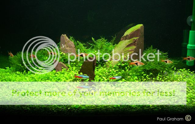
Full length shot.
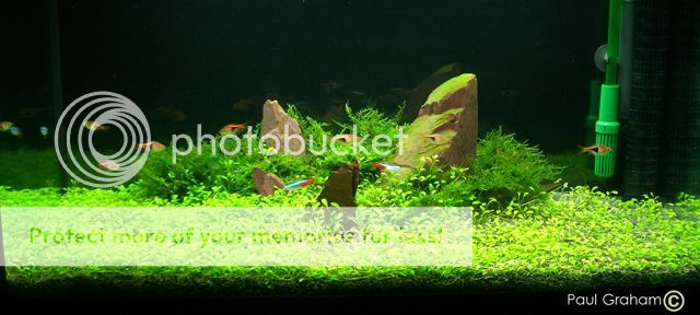
And the final one which i think looks quite good. Some pearling Glosso.

Feel free to post any comments, good or bad
Paul.
I know its not perfect, but I'm really quite happy with it, I wanted an Amano type layout with minimal maintenance and thats what i've got.
Here's the finished pics, it's probably the last pic's i'll post of the tank, as i'm currently looking into stripping the tank down and venturing over to the dark side of Cichlids
Anyways here's the final pictures..
Close up
Full length shot.
And the final one which i think looks quite good. Some pearling Glosso.
Feel free to post any comments, good or bad
Paul.
George Farmer
ad aqua
Very, very well done Paul. I'm impressed.
I still feel the rock placement could improve but other than that it is an excellent layout and you should be proud. May I suggest you post this in the pinned member's planted tank thread.
Hide the equipment if you photograph for contest BTW.
I still feel the rock placement could improve but other than that it is an excellent layout and you should be proud. May I suggest you post this in the pinned member's planted tank thread.
Hide the equipment if you photograph for contest BTW.
IovaykInD
Fish Herder
WOW..it looks soo good. No bad comments on it, it's too beautiful for any of that.
*EDIT*
KEEP THE TANK, DON'T STRIP IT. IT WOULD BE SUCH A WASTE
*EDIT*
KEEP THE TANK, DON'T STRIP IT. IT WOULD BE SUCH A WASTE
The rams had to go back to the shop because they kept eating my expensive shrimp!!! I really liked them too, full of personality and quite entertaining. Thats what's attracting my to keeping Cichlids for a change.
I'll come back to planted tanks at some point, i've learned too much over the past 2 years not too. I just think it would be good to try other things. I suppose thats whats good about this hobby, there are so many different things to try.
Paul
I'll come back to planted tanks at some point, i've learned too much over the past 2 years not too. I just think it would be good to try other things. I suppose thats whats good about this hobby, there are so many different things to try.
Paul
Jer-
Fish Crazy
Paulioo...
Ur tank is absolutely amazing. The rockwork and the moss together is beautiful. the glosso looks very healthy as well, unllike mine.
anyways it would be such a shame if u striped it down. If i had a tank like urs id think, for many countless times over doing anything drastic like stripping it.
Whatever u decide to do, Congratulations with ur success with this tank. Its a beaut.
kenneth_kpe
Lider op da pises.
turned out nice ! i like!
i like!jimbooo
James flexton
fantastic result mate it looks awesome. i see you have the same fiddling tendancies as me. i dont think a layout has survived more then 3 months with me.
out of interest (and this isn't critisism at all) do you know why the glosso didn't quite fill out as much to the right as it did to the left. are the lights central?
i'm just trying to think if a reason why that happened, would be good to know.
well done though, it looks wonderful
out of interest (and this isn't critisism at all) do you know why the glosso didn't quite fill out as much to the right as it did to the left. are the lights central?
i'm just trying to think if a reason why that happened, would be good to know.
well done though, it looks wonderful
Similar threads
- Replies
- 3
- Views
- 381
- Replies
- 6
- Views
- 449
- Replies
- 13
- Views
- 482
Most reactions
-
 340
340 -
 258
258 -
 219
219 -
 196
196 -
 163
163 -
 147
147 -
 142
142 -
 127
127 -
 109
109 -
 106
106 -
 101
101 -
 95
95 -
 85
85 -
 85
85 -
 78
78