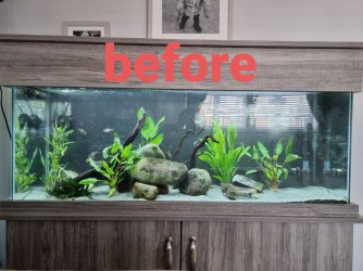
I think it's looks ok. But like already mentioned it is probably too central. Composition wise the simplest way to get a "pleasing' layout is to divide it into thirds horizontally and vertically. Then you want the main points of focus to be somewhere these lines meet.
It also helps to have the "lines" of the tank flow towards the point of focus. You pretty much have that bit going on well already, it just needs shifting to the right a bit.
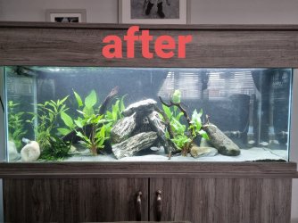
Quick MS paint below to try and show what I mean. You want the middle of the main rock pile to be on the right hand line then keep a similar curve as you have now running down the the left. This point it in a "pleasing" space and the curve of the rocks draws your eyes to the main point of focus.
View attachment 143186
Edit: If you look at the photo in my sig that is another example of what Im talking about. I had the main point of focus on the left side 1/3rd of the way in. The second point of focus was on the right, again 1/3rd of the way in. I then had a line that leads from the minor point of focus to the main point of focus.


")


 F-1 Angel... a bit nervous... it'll be my 1st F-1 fish...